
UI/UX Designer
March 2025 – October 2025



Roles & Responsibilitie
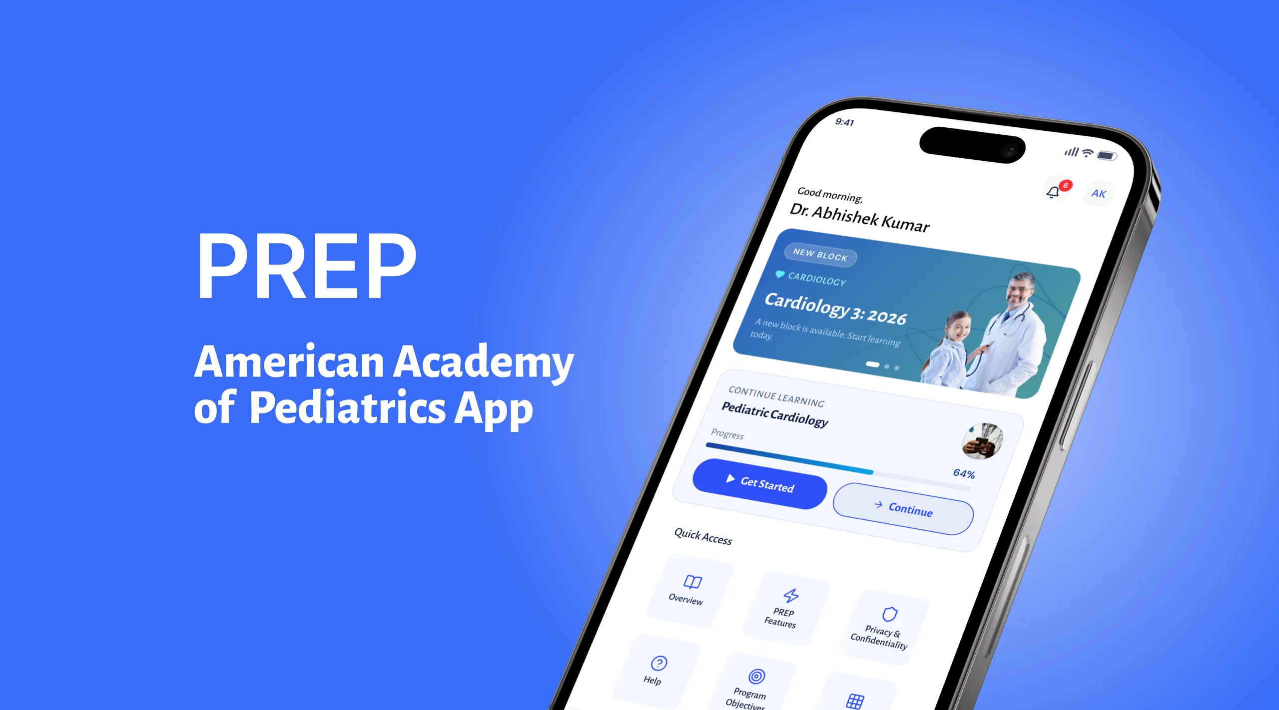
I designed a PediAssess is a mobile-first self‑assessment and clinical readiness app designed for pediatricians. The app helps doctors periodically evaluate their knowledge, diagnostic accuracy, and adherence to updated pediatric guidelines through structured assessments, case-based questions, and performance insights.
UX Design
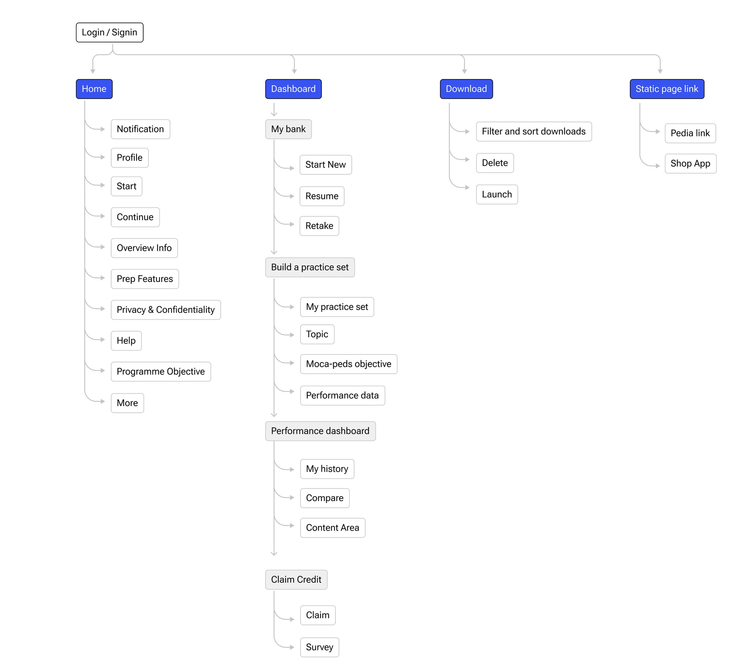
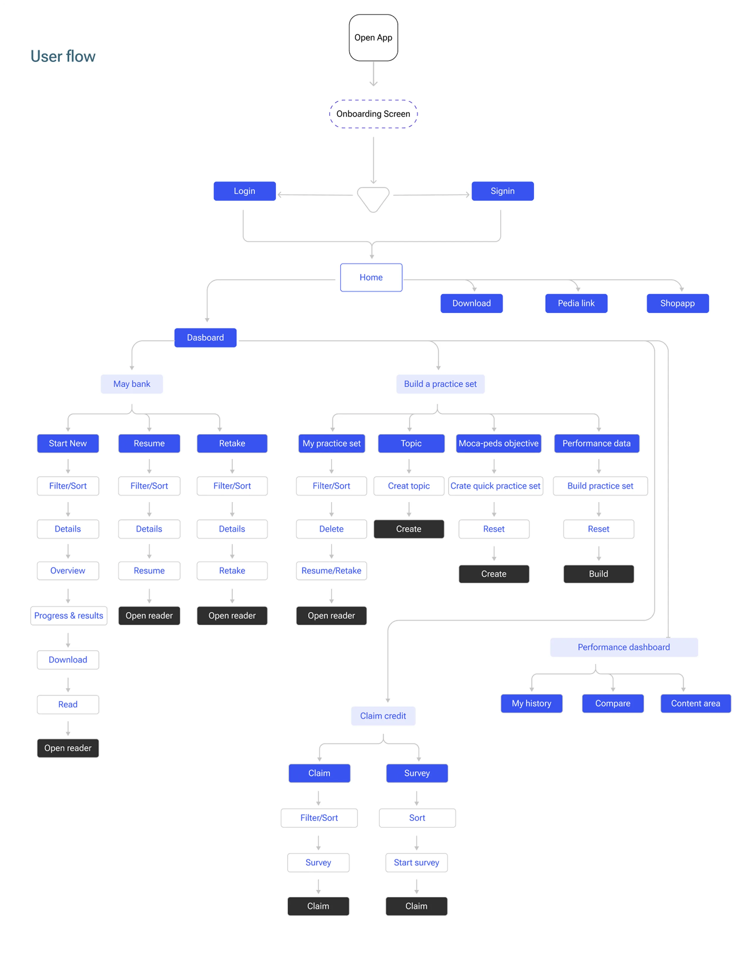
Designed the end-to-end UX for PediAssess, a mobile-first self-assessment app for pediatricians. Conducted user research, created user flows, wireframes, and prototypes, and designed an intuitive interface for assessments, case-based learning, and performance tracking, with a focus on usability and clinical efficiency.
UI Design
Designed a clean, intuitive, and mobile-first UI for PediAssess, creating visually consistent interfaces that simplify assessments, case-based learning, and performance tracking while enhancing usability and accessibility.

Research & Analysis
Uncovering what pediatricians need — and what current tools fail to deliver. Eight core friction points mapped to eight targeted solutions.
Problem Identified
Limited Time & High Workload
Pediatricians need quick, efficient tools that fit into busy clinical schedules.

Fragmented Learning Experience
Self-assessment and progress are scattered across multiple platforms, making learning difficult to manage.

Complex & Unclear User Experience
Cluttered interfaces, limited feedback, and poor mobile usability reduce learning efficiency.

Lack of Confidence & Progress Visibility
Limited progress tracking and unclear guideline sources make it difficult to measure improvement and build trust.

Solutions
Save Time with Smart Assessments
Short, focused assessments and instant feedback help pediatricians learn efficiently within busy schedules.

Unified & Simple Experience
A clean, mobile-first interface with a centralized dashboard makes assessments and progress easy to access.

Measure Progress Effectively
Performance tracking and personalized insights help users monitor improvement over time.

Build Confidence Through Trust
Evidence-based references and supportive feedback create a reliable, stress-free learning experience.

Meaningful Findings
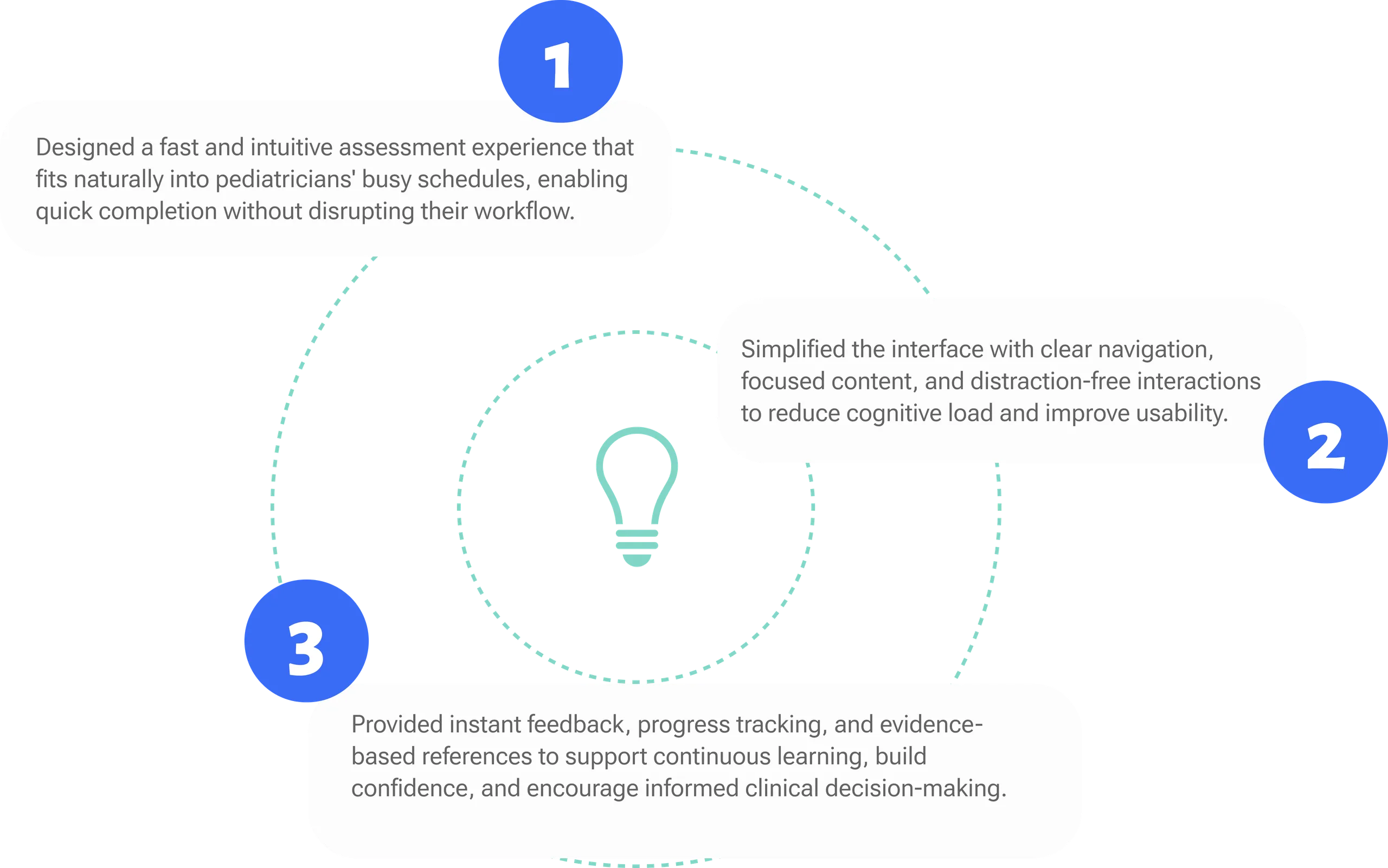
Defined
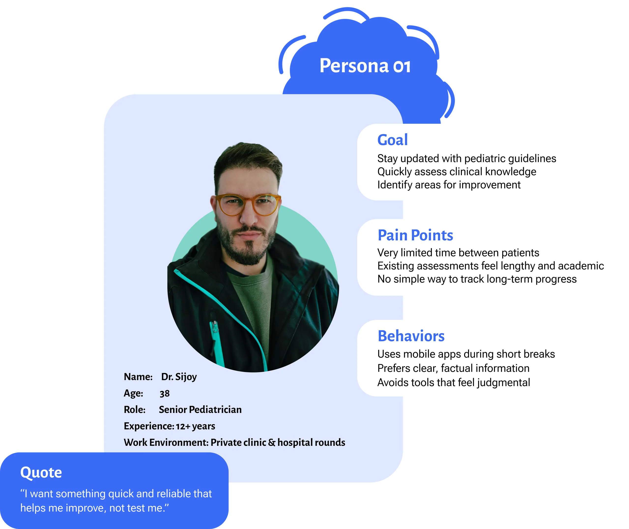
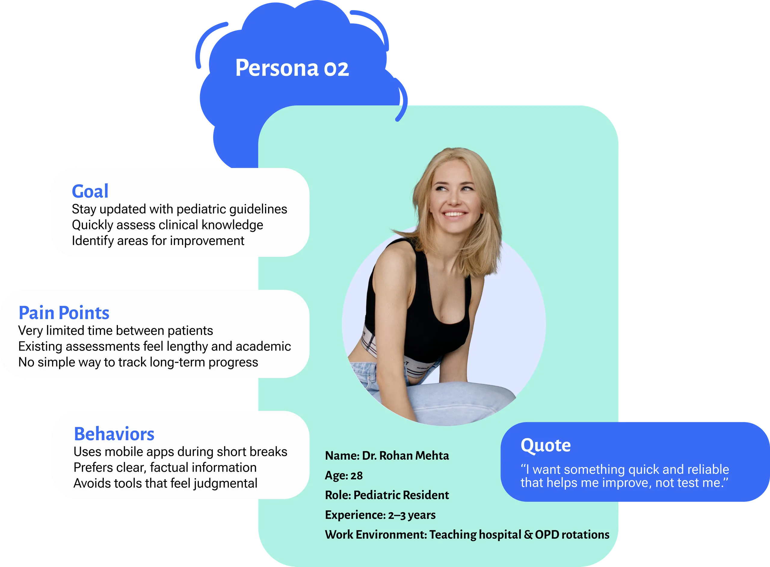
Empathy Mapping
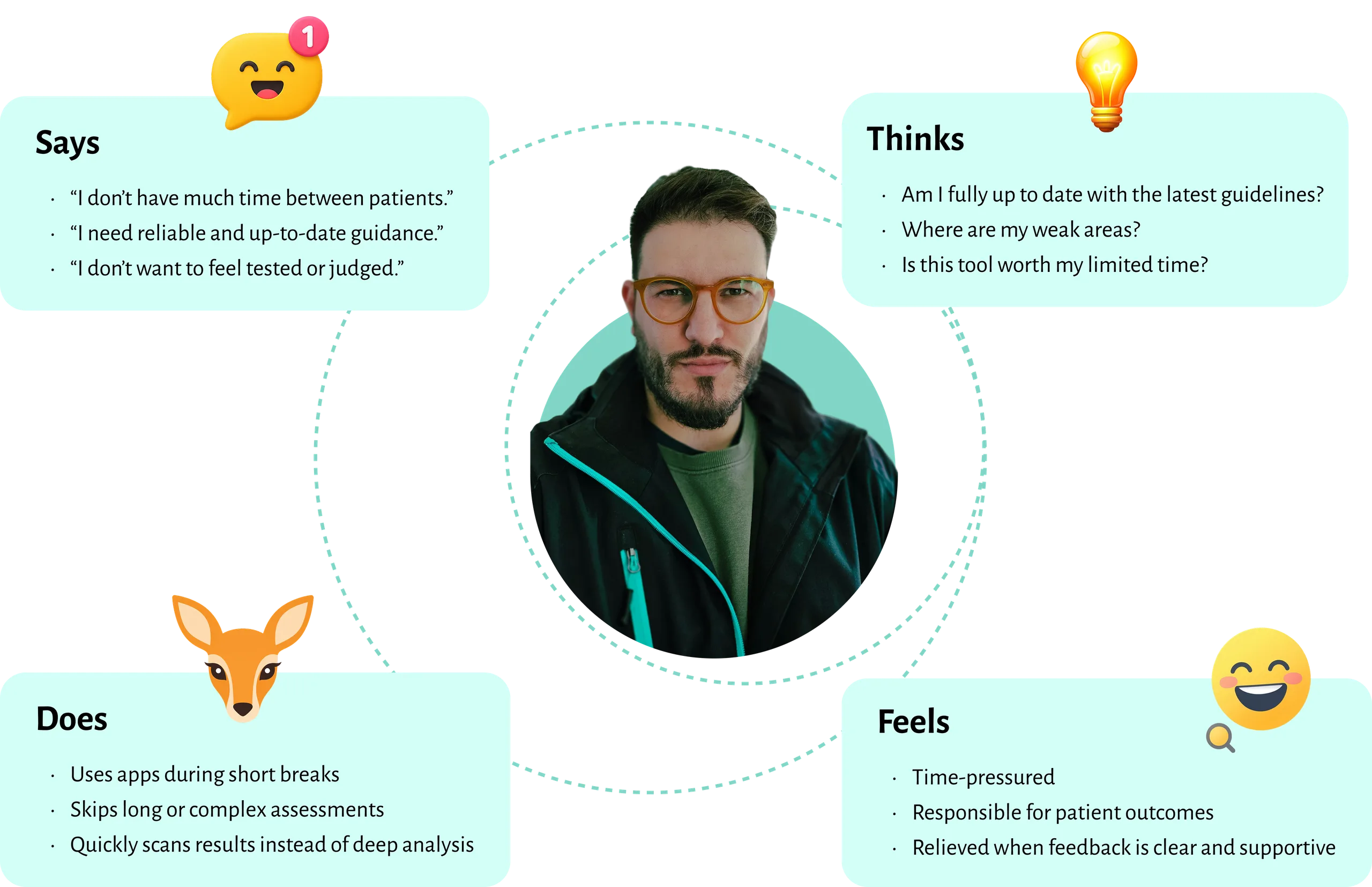
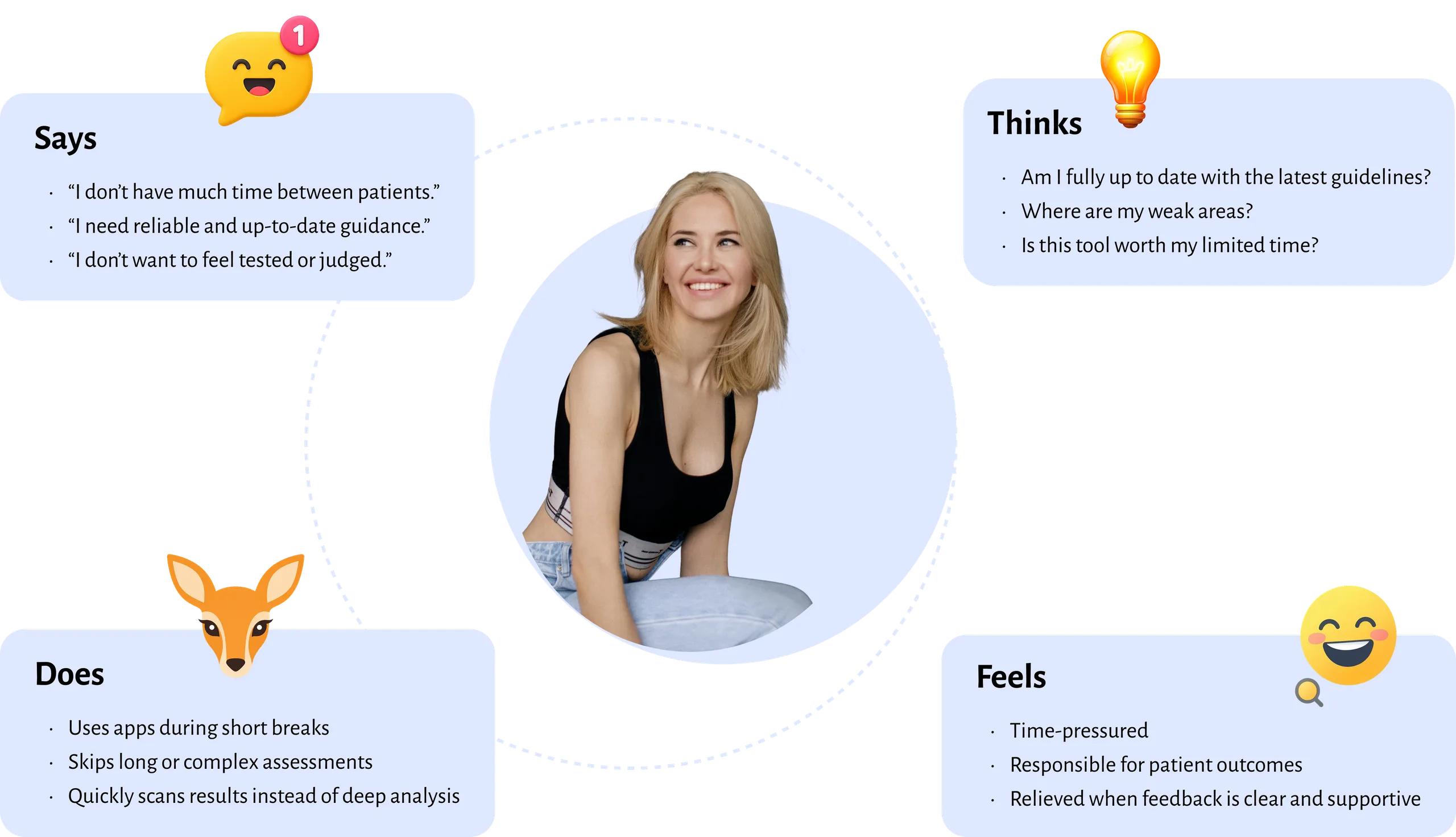
User Journey
Scenario: Pediatrician completing a quick self-assessment
| Stage | User Action | User Thinking / Feeling | UX Solution |
|---|---|---|---|
| Discover | Opens PediAssess during a short break | “I only have a few minutes.” | Clear entry point with quick assessment option |
| Select | Chooses a short assessment | “This looks manageable.” | Time-bound assessments (5–10 mins) |
| Answer | Responds to case-based questions | “Easy to read, no clutter.” | Simple language and clean layout |
| Feedback | Views correct / incorrect indicators | “I know instantly where I stand.” | Immediate, clear feedback |
| Review | Checks results summary | “What should I improve?” | Strengths & improvement highlights |
| Track | Views progress history | “Am I improving over time?” | Progress tracking and trends |
| Learn | Opens guideline reference | “I trust this source.” | Verified pediatric guideline links |
| Exit | Leaves app feeling confident | “That was quick and useful.” | Supportive tone and no judgment |
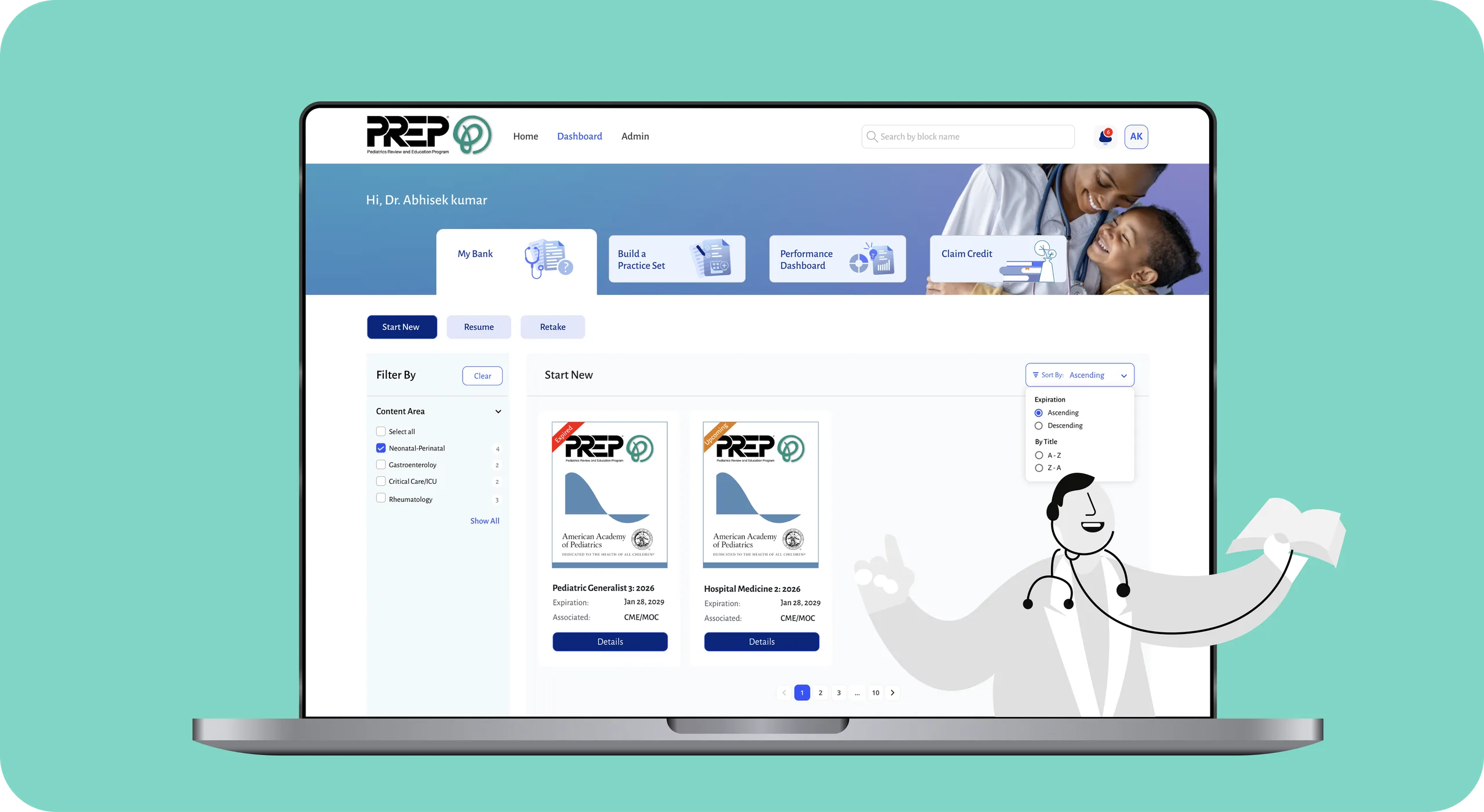
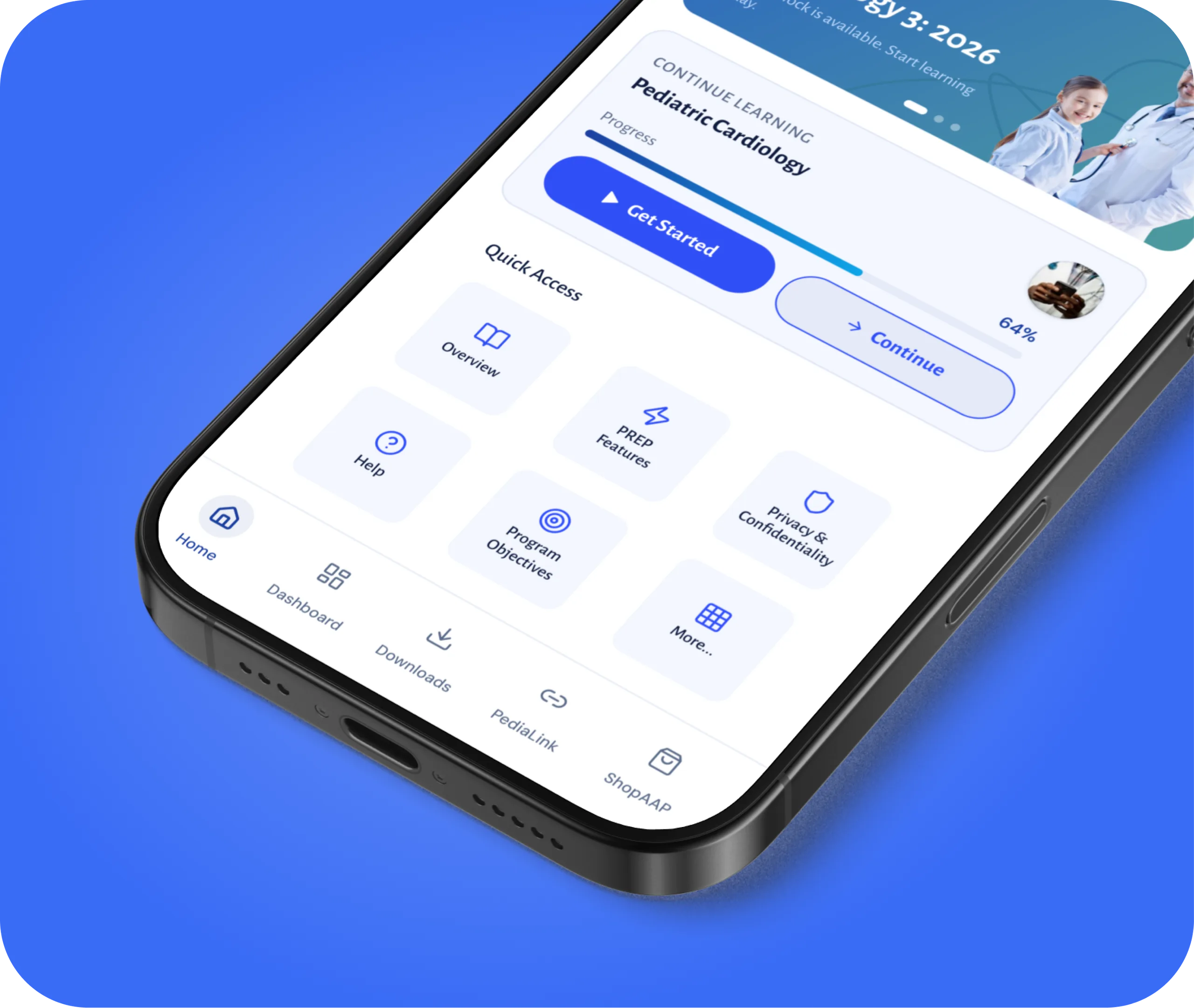
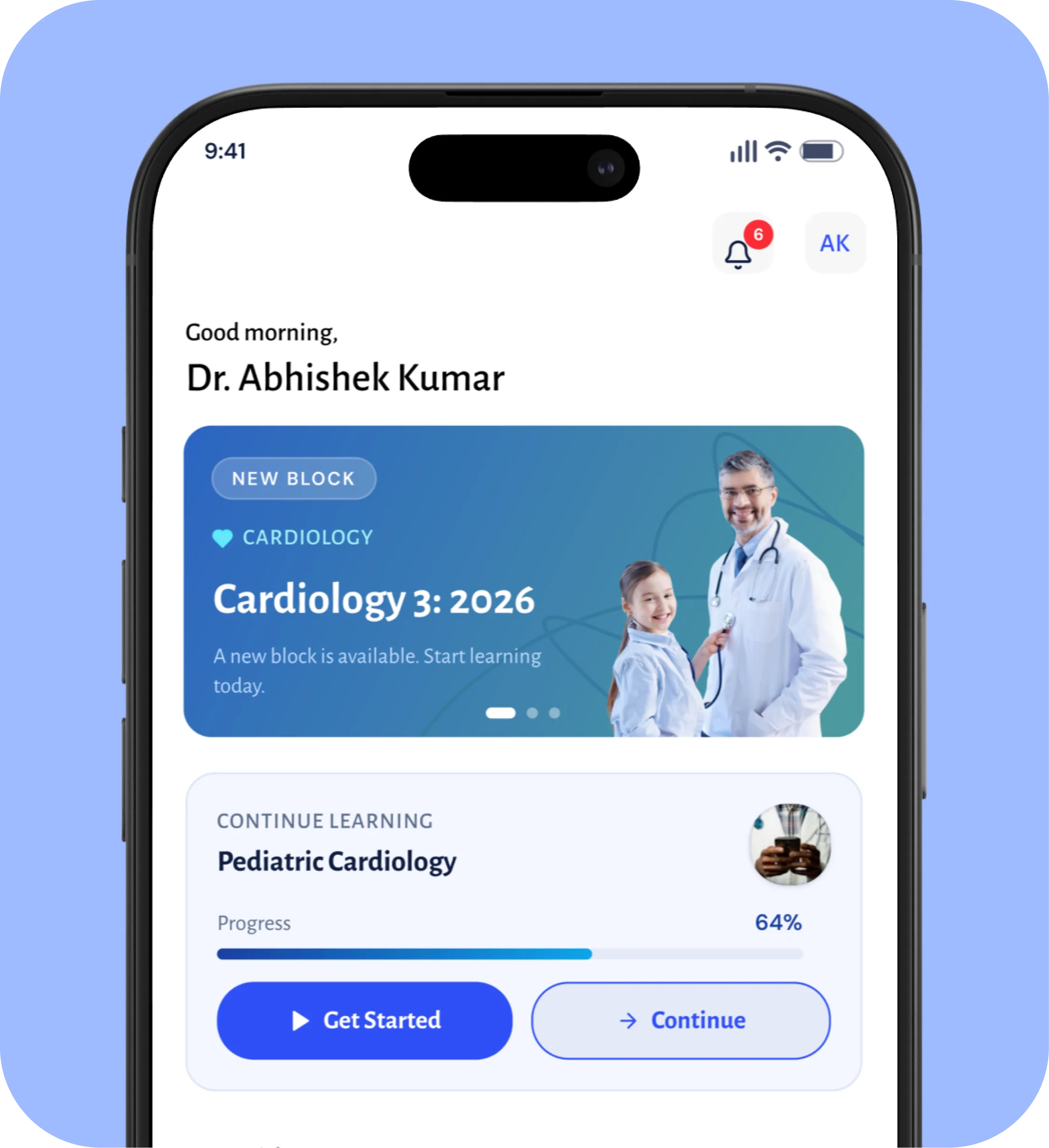
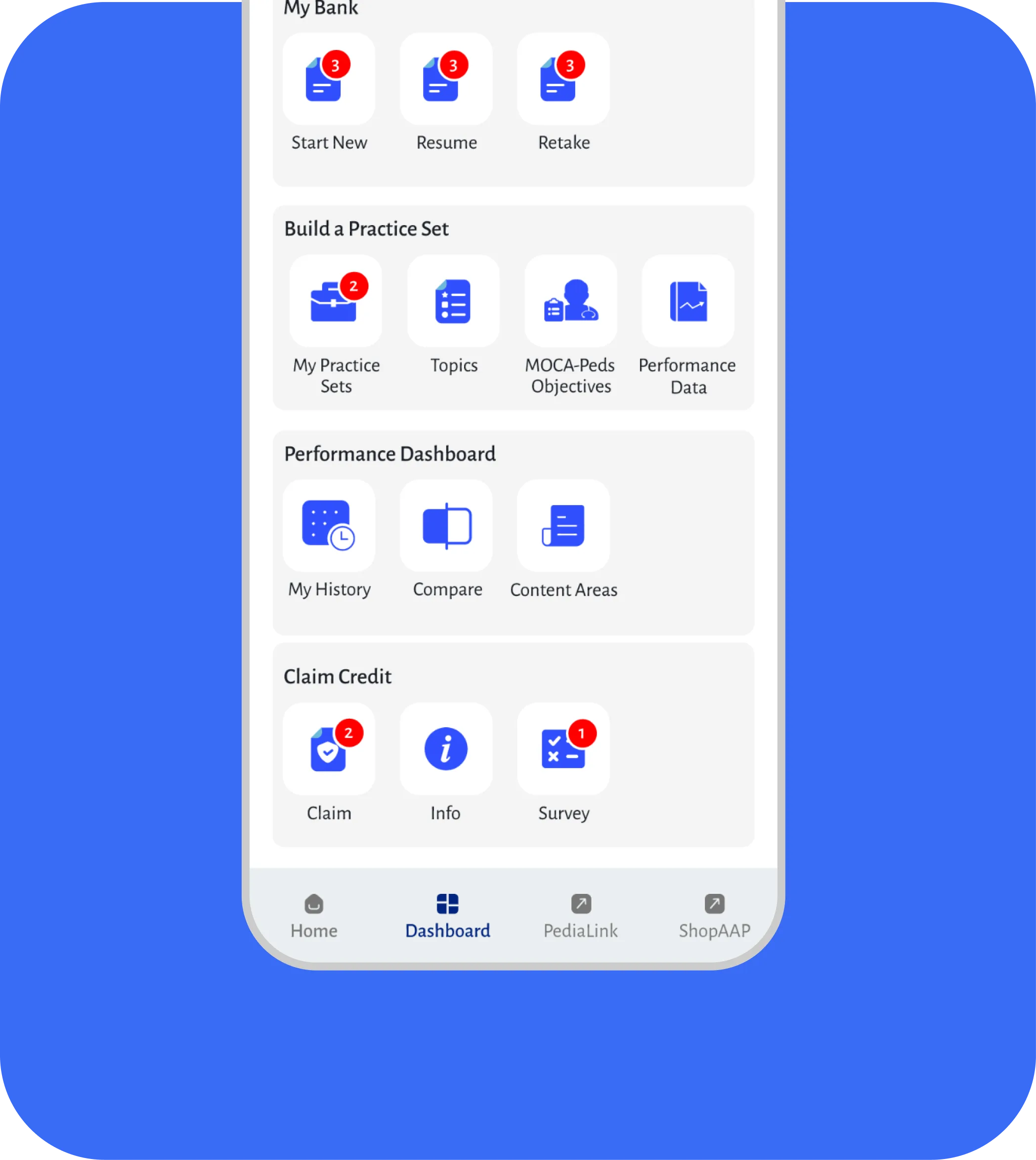
Home Screen
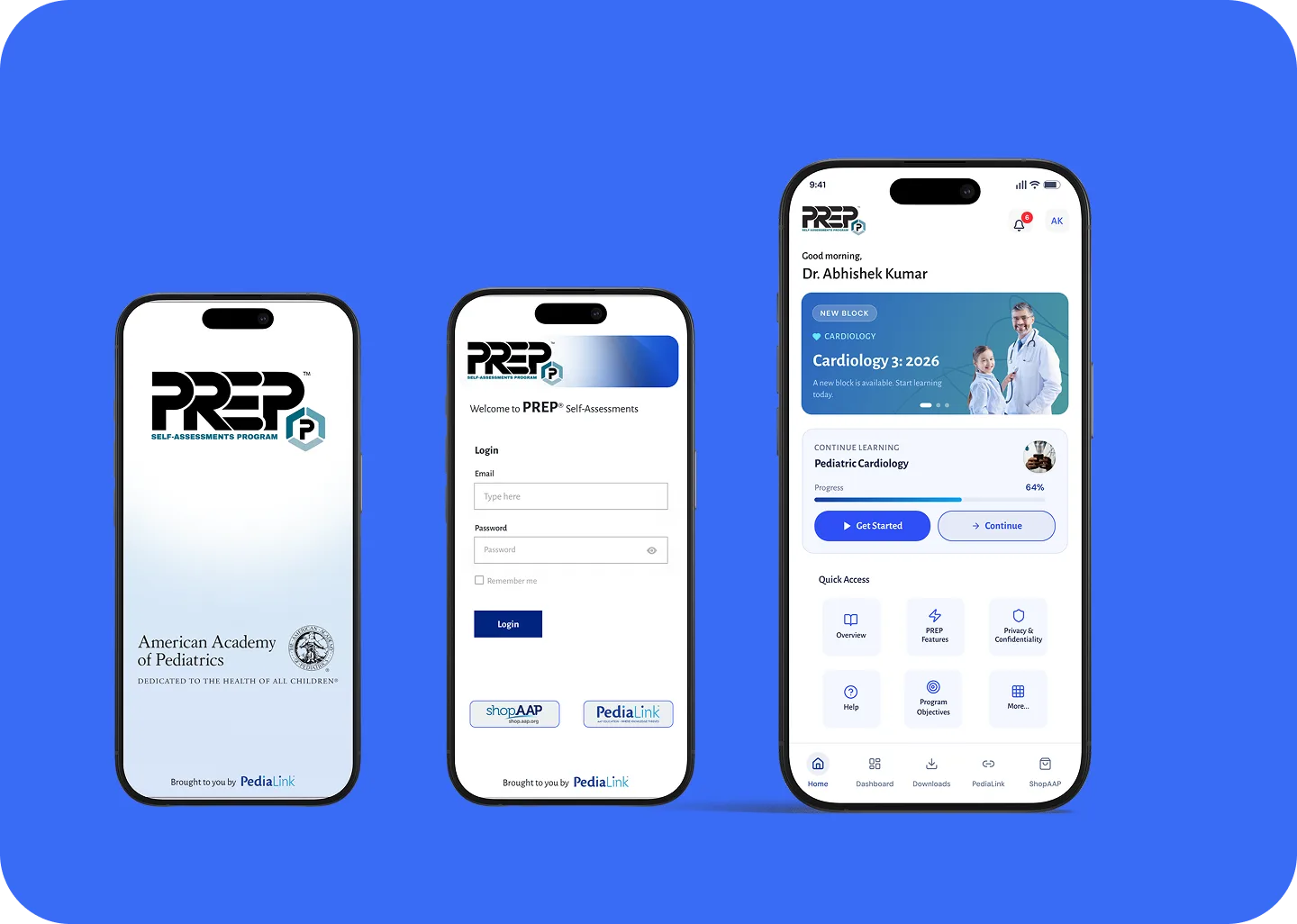
Dashboard My Bank
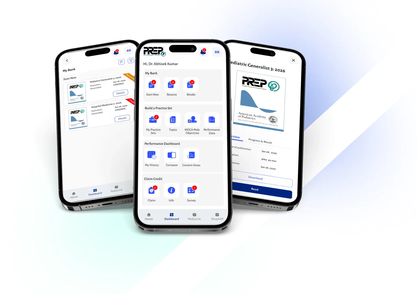
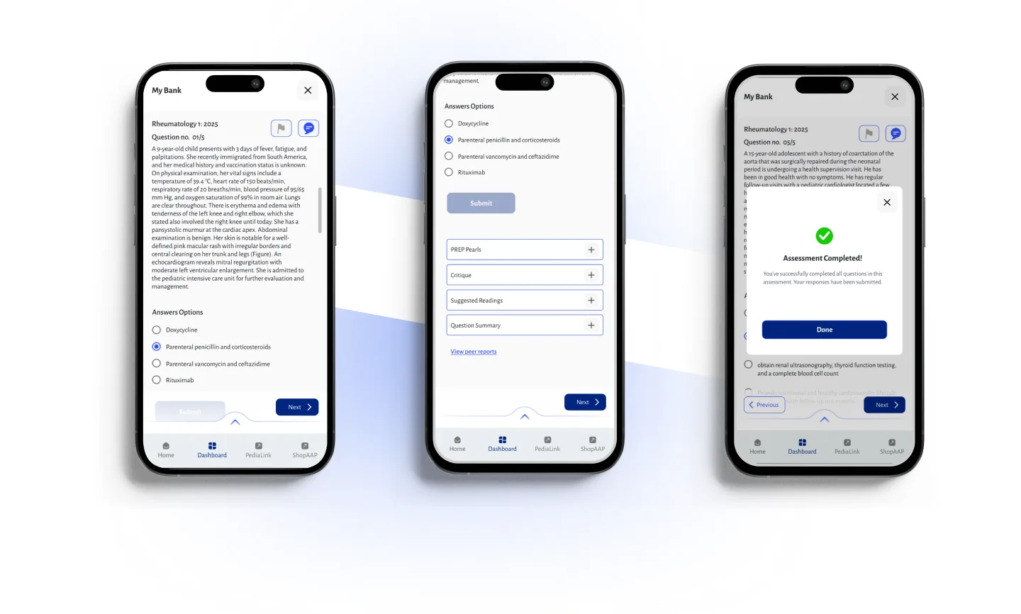
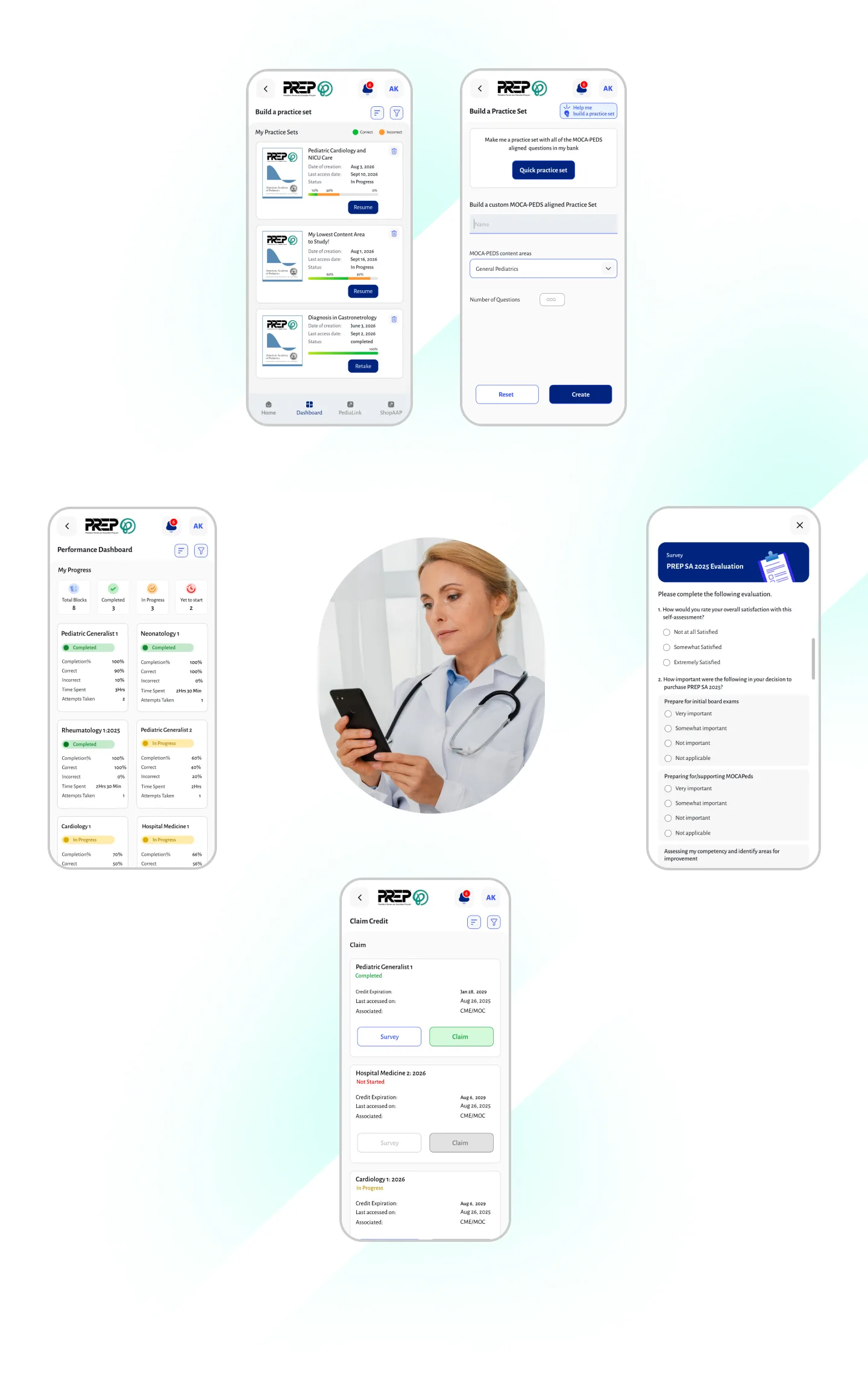
Visual Design
Design system and creating a clear and consistent healthcare experience.
Alegreya Sans
0123456789
abcdefghijklmnopqrstuvwxyz
ABCDEFGHIJKLMNOPQRSTUVWXYZ
Color Palette
Primary Colour
#00247F
Secondary Colour
#304FFE
Neutral Colour
#ECEFF1
Neutral Colour
#B0BEC5
Neutral Colour
#4B505F
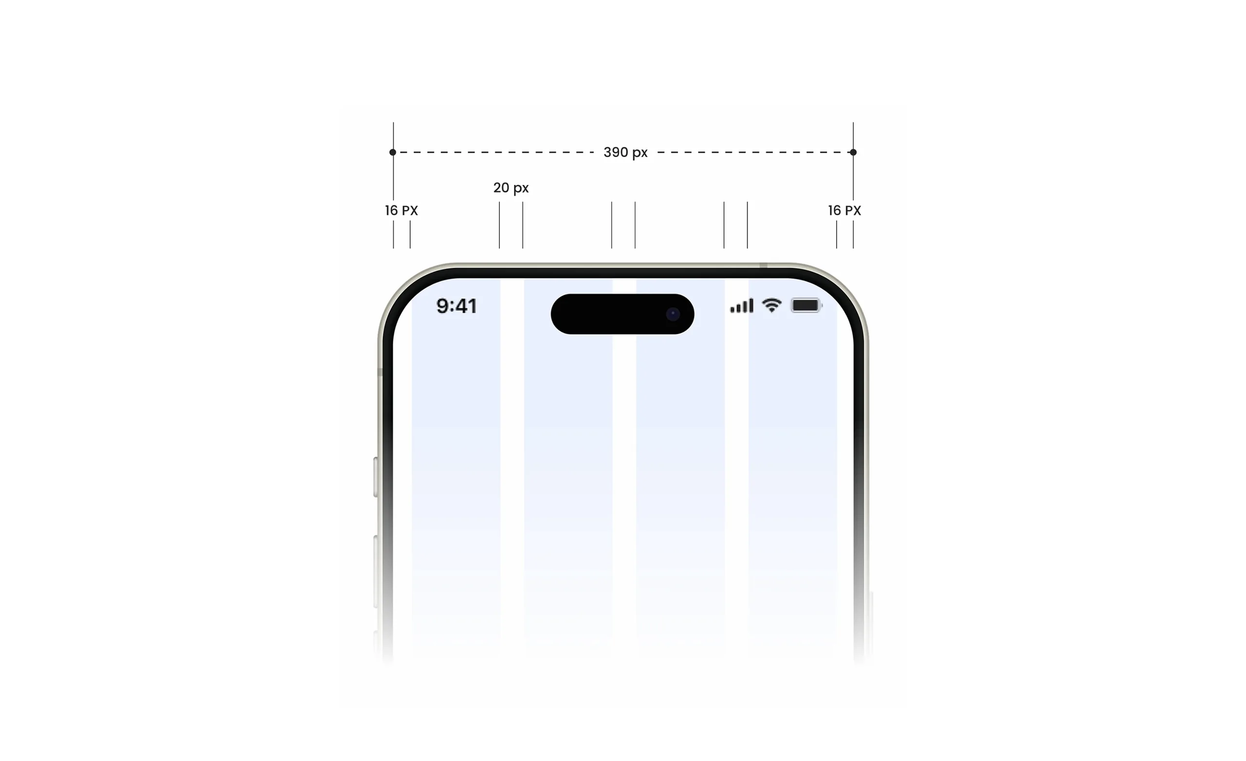
Grid System
UI Kit


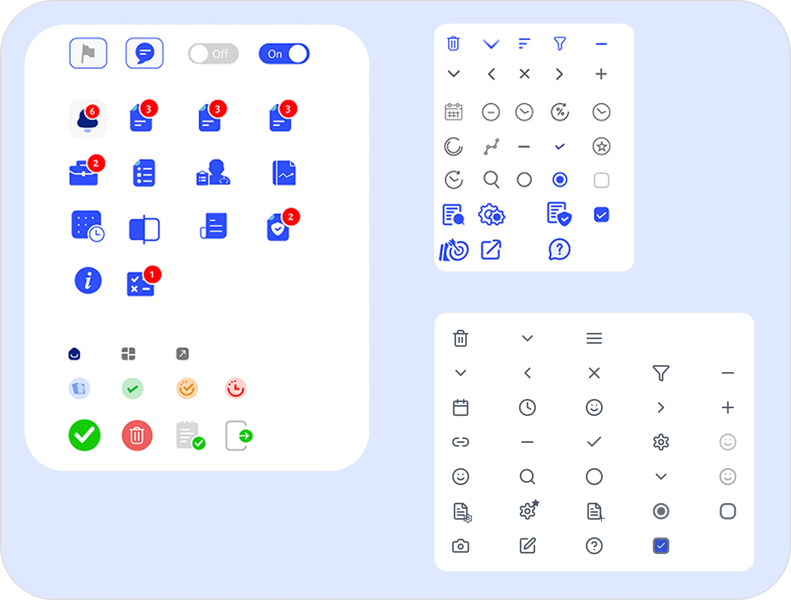
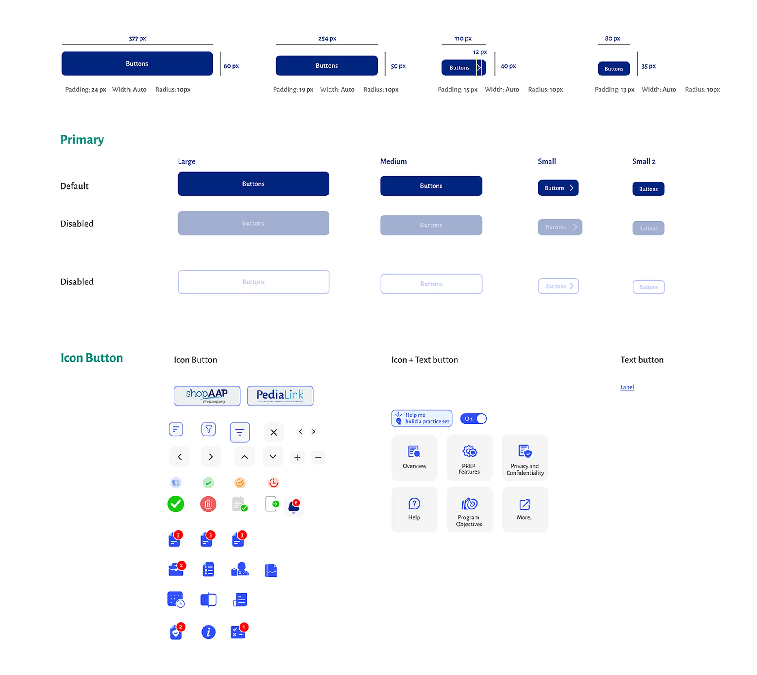
Buttons
Buttons are interactive elements that guide users to take action. They exist in multiple styles and sizes to ensure consistency and flexibility across the interface. Each type is optimized for different use cases, from primary calls-to-action to secondary support actions.
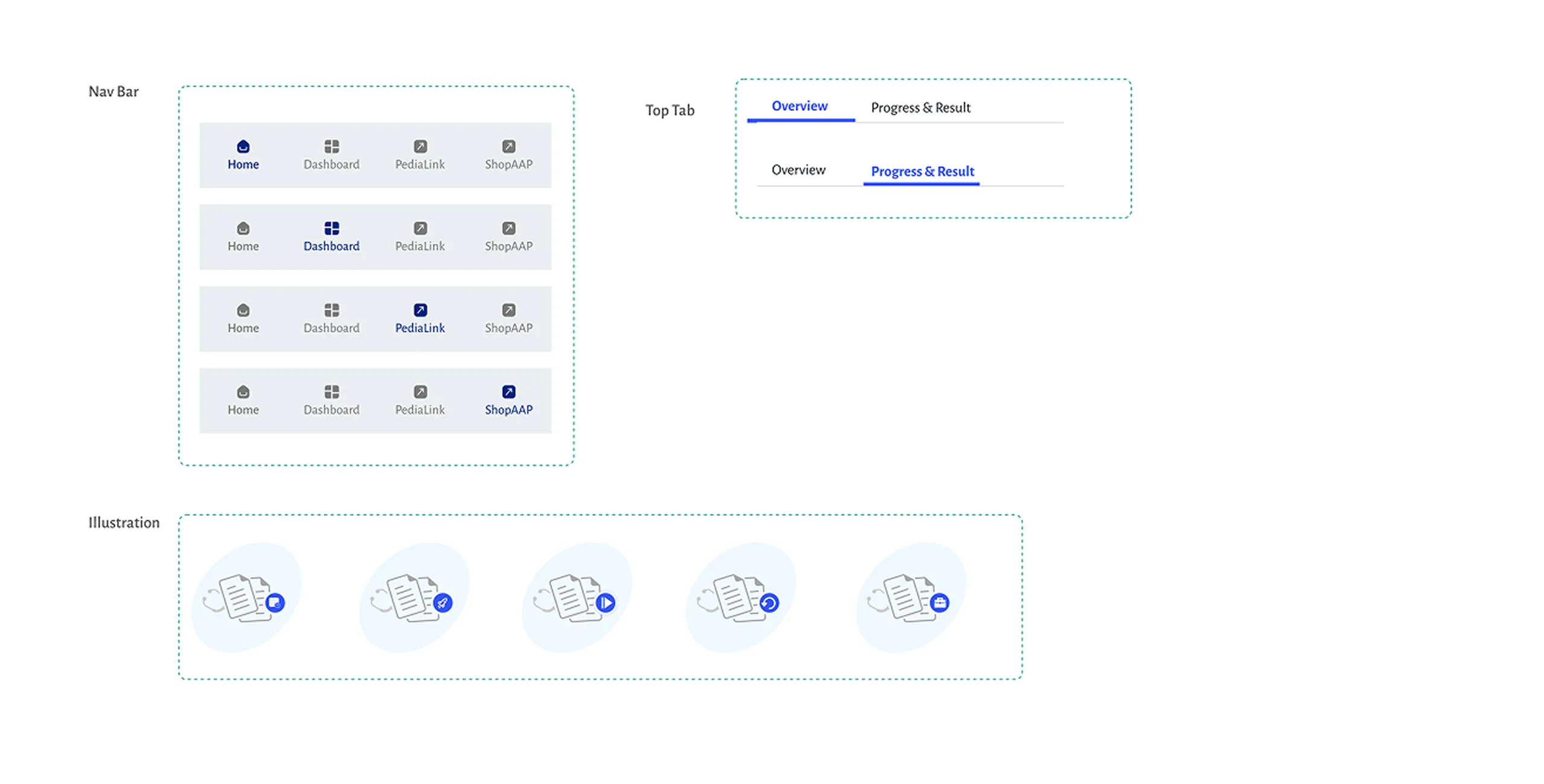
Components
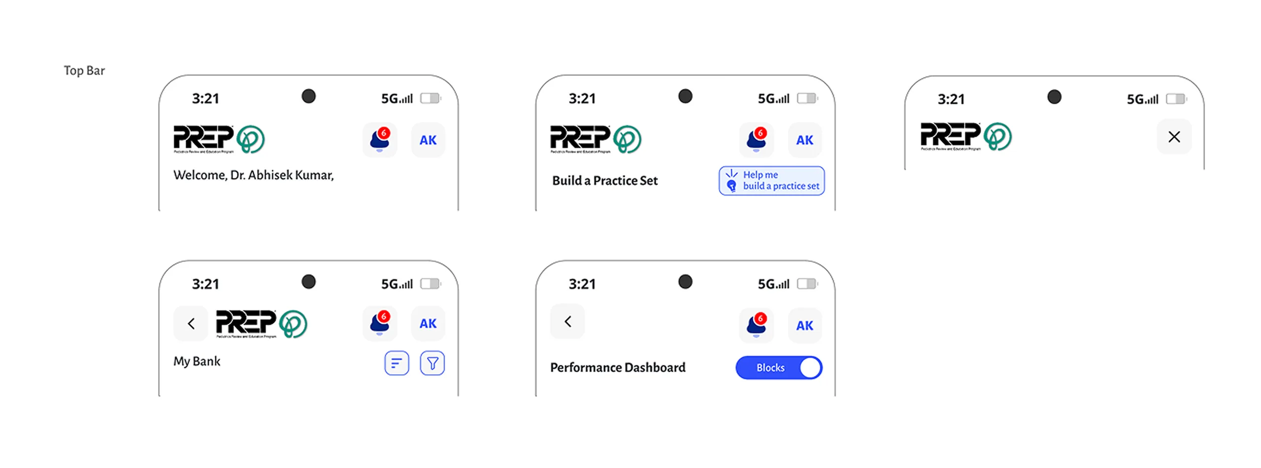
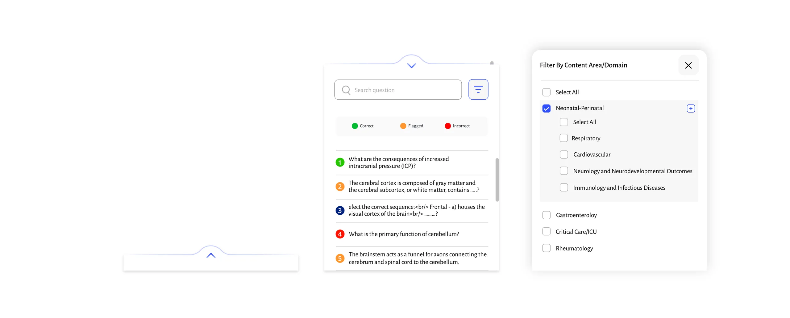
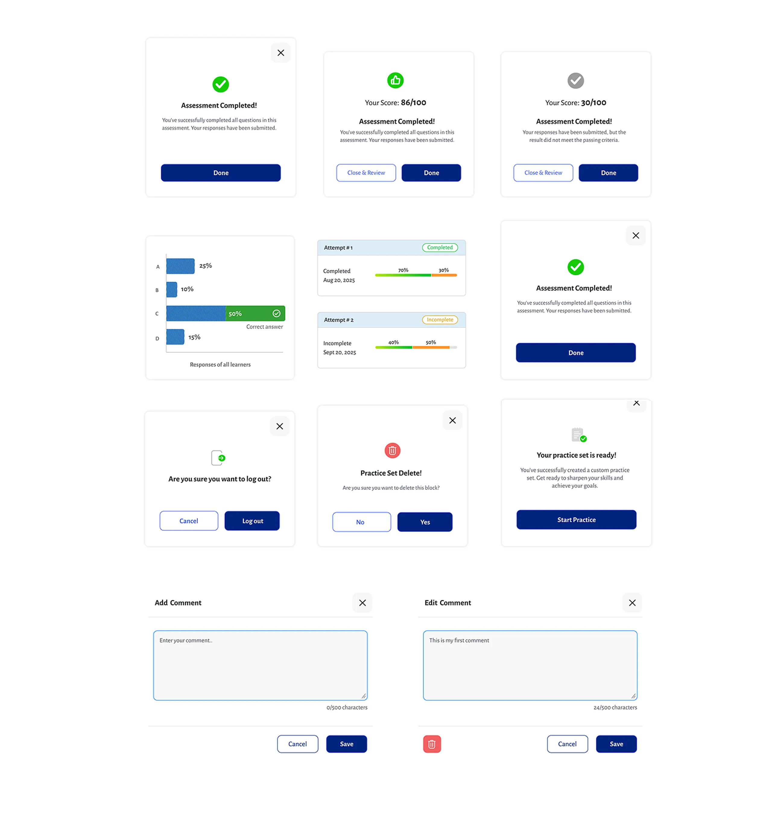
Components are the building blocks of the interface. They ensure consistency, reusability, and scalability across the design system. From product cards and sticky bars to modals and bottom sheets, these components support key user interactions and streamline the overall experience.
Sticky Toast Bar
A lightweight, non-intrusive notification that appears temporarily at the bottom of the screen to confirm an action or provide quick feedback, without interrupting the user's workflow.
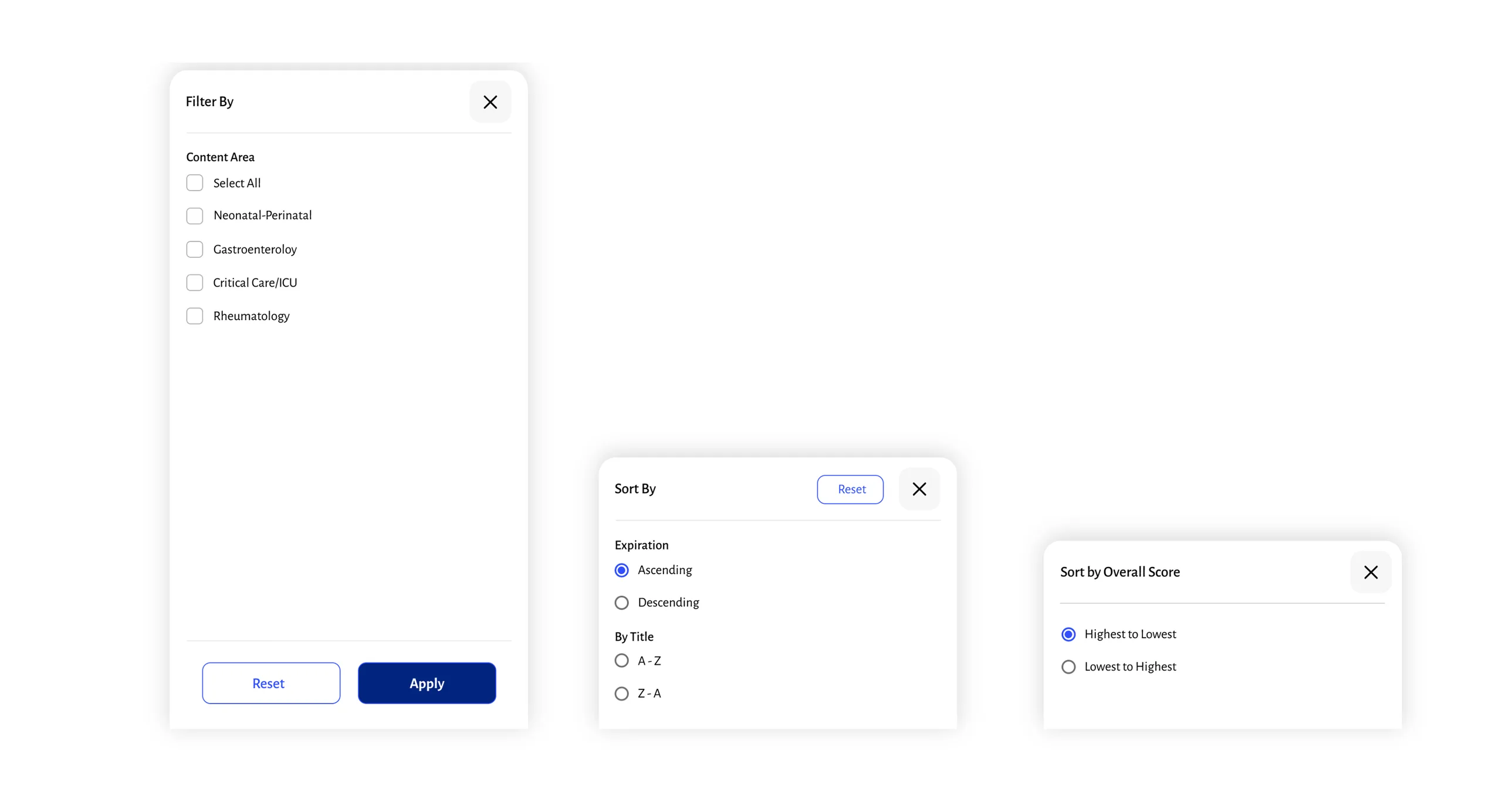
Drawer
Modal
A focused overlay that captures user attention for critical actions or information, temporarily blocking interaction with the rest of the interface until a decision is made.
Product Card

Card Carousel